Monday, June 20, 2011
Not Sore Losers
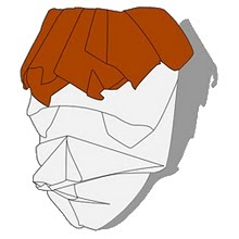
I'll start off by saying I'm not a hockey fan at all, despite being Canadian. I originally wanted to fold the Canucks alternate logo with 2 sheets of paper to get the blue, green and white but the model ended up being too messy and with too much wasted paper. I ended up using the same hockey stick shape and adding arms and a body.

Subscribe to:
Post Comments (Atom)


No comments:
Post a Comment